Mobile traffic now makes up most of the web, so a site that works on phones and tablets isn’t optional , it’s a must. Below is a usable walk‑through that takes you from sketch to launch, so your pages look great on any screen.
Step 1: Plan Your Mobile‑First Layout
Start with a quick content audit. List the core messages, primary calls to action, and any forms you need on the smallest screens. Keep the list short; a mobile user should see the goal within a tap or two.
Next, sketch low‑fidelity wireframes that focus on the mobile view. Use large touch targets, generous spacing, and clear hierarchy. The goal is to make every tap feel easy, even on a thumb‑size screen.
When you have a solid mobile wireframe, flip the canvas and add desktop enhancements. Think of it as adding layers , not a whole new design. This approach lets you reuse components and keep the codebase lean.
Lakeway Web Development follows this exact workflow for its clients, pairing the mobile‑first sketch with AI‑powered search integration so the most relevant content rises to the top on every device.
Step 2: Use Flexible Grids and Layouts
Grids give you a predictable way to place elements that adapt as the viewport changes. Most frameworks use a 12‑column system; you can also craft a custom grid with CSS grid‑template‑areas.
First, setbox-sizing: border-boxon all elements so padding and borders stay inside the defined size. Then create a container withdisplay: gridand define your columns. For a simple two‑column layout that collapses on small screens, usegrid-template-columns: 1fr 1frand add a media query that switches togrid-template-columns: 1frunder 600 px.
W3Schools provides a clear example of building a grid container with five items , header, menu, content, facts, and footer , and shows how media queries adjust the layout for different breakpoints. W3Schools grid guide is a solid reference for the syntax.
When you define your breakpoints, think about the content flow. A column that holds a sidebar on desktop should become a full‑width block on mobile, preventing horizontal scrolling.
We often use the Top Web Application Development Services for 2026 page as a real‑world example of a fluid grid that works across phones, tablets, and desktops.
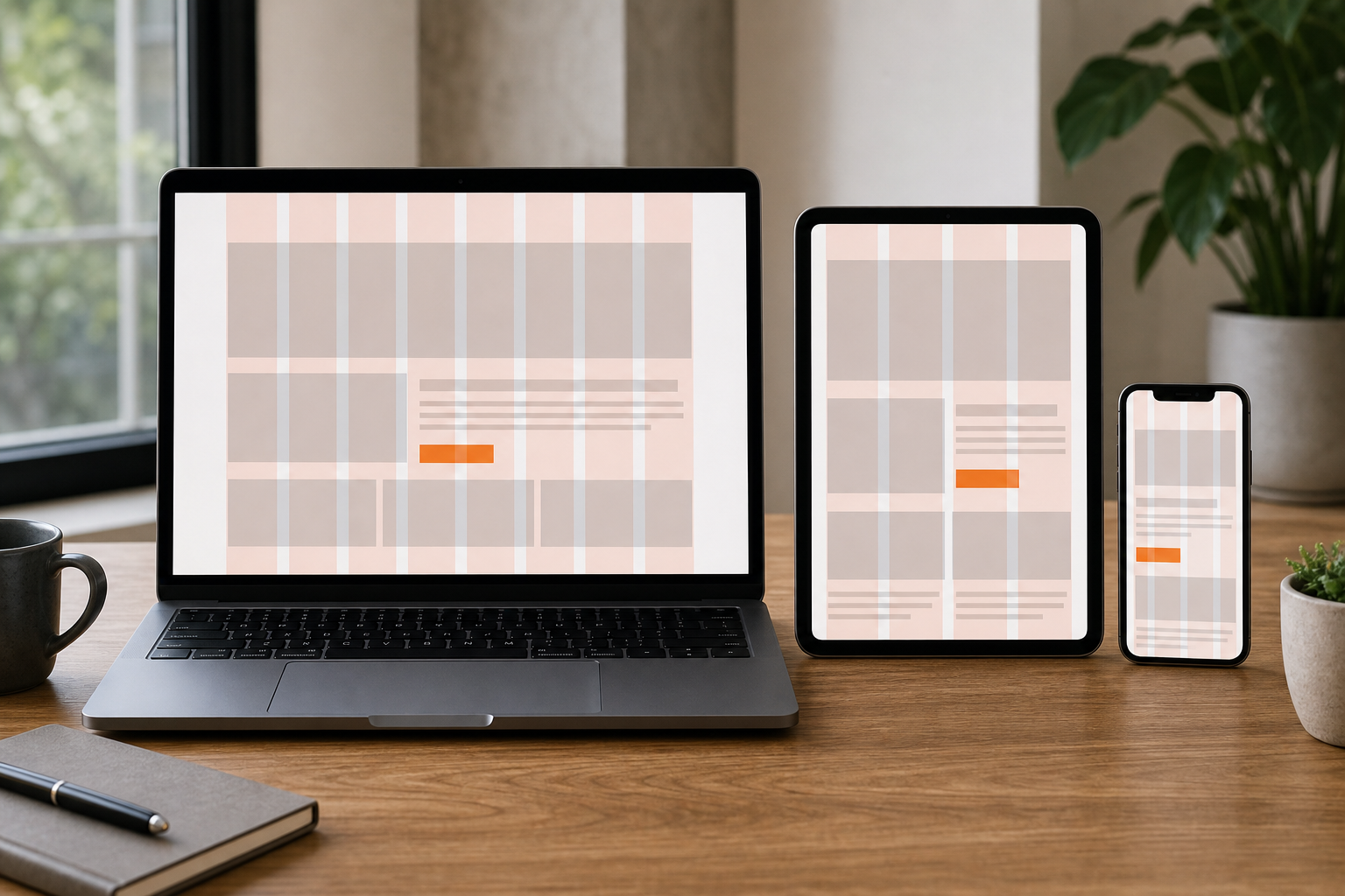
Remember to test the grid with real content , placeholder text can hide overflow issues.
Step 3: Optimize Images for Responsiveness
Images often eat the most bandwidth on mobile. Serve the right size for each device by usingsrcsetandsizesattributes on<img>tags. This lets the browser pick the smallest file that still looks sharp.
Start by creating several versions of each image: a tiny thumbnail for phones, a medium size for tablets, and a large version for desktops. Then write asrcsetlist that maps each file to its width descriptor, e.g.,image-480w.jpg 480w, image-800w.jpg 800w.
Usingsrcsetandsizestogether reduces download size while keeping visual quality. MDN responsive images guide gives code snippets you can copy straight into your markup.
Don’t forget vector graphics for icons and simple illustrations , SVG scales without extra files and stays tiny.
Lakeway Web Development routinely addssrcsetto client sites, pairing it with lazy‑loading scripts so images only load when they enter the viewport.
After you implementsrcset, run a network audit in Chrome DevTools to verify that the smallest image is delivered on a simulated 375 px viewport.
Step 4: Implement Responsive Navigation
Navigation is the backbone of usability. On mobile, the most common pattern is a hamburger icon that expands into an accordion or slide‑in panel.
Keep the menu shallow , two levels at most , to avoid users getting lost. Use clear labels and a single icon to indicate open or closed state. This reduces visual clutter and speeds up decision making.
It's common knowledge that too many icons can overwhelm users, so many brands opt for a single chevron that flips direction when the menu opens. Using contrast and typographic weight to highlight the most important items further improves menu clarity.
When you build the markup, wrap the links in a<nav>element and hide the list with CSSdisplay:noneuntil the button is tapped. Then toggle a class that setsdisplay:blockand animates the height.
We often point clients to Best Cross Platform Mobile App Development Guide 2026 for examples of navigation that works on both web and native shells.
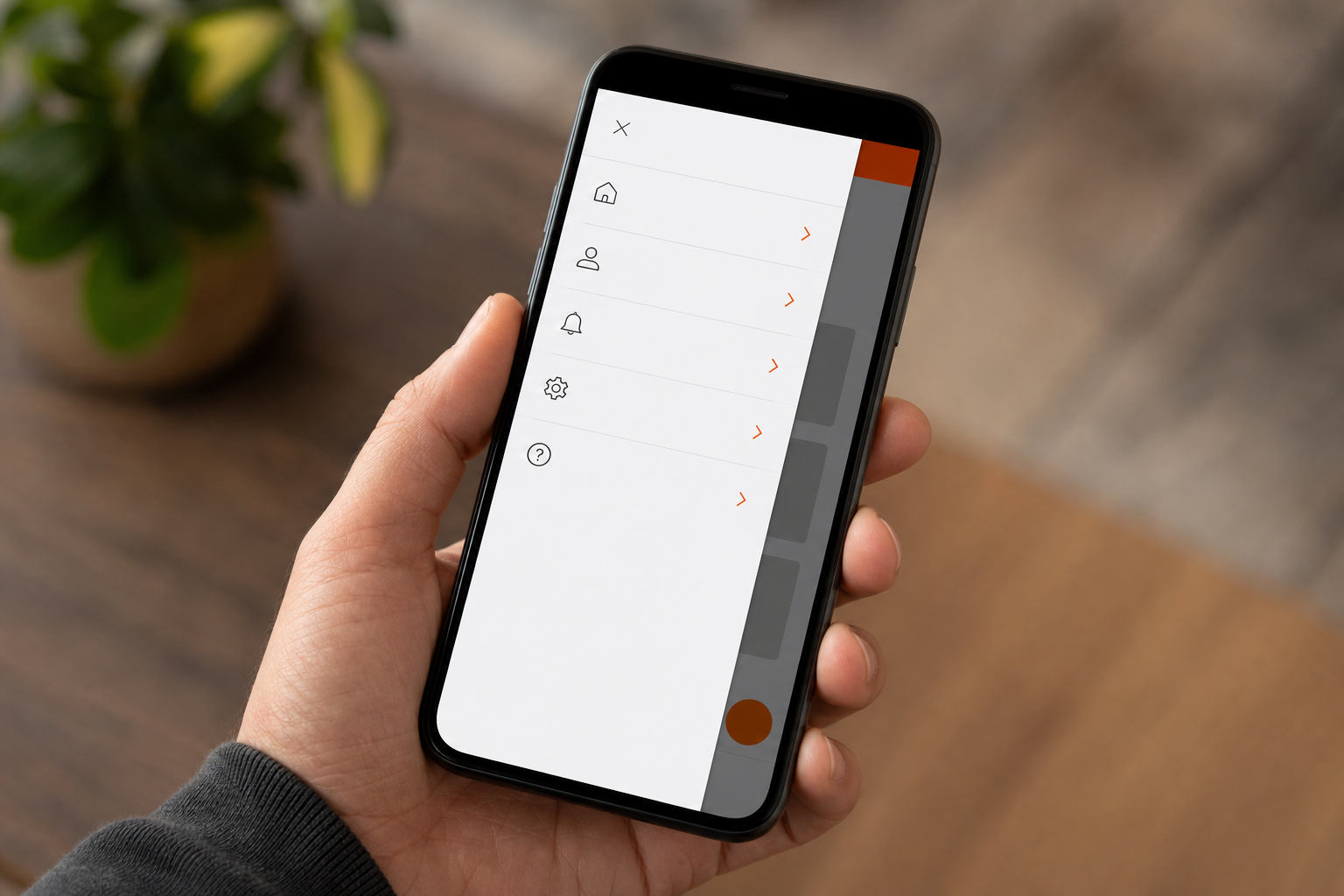
Test the menu with screen‑reader tools to ensure the toggle button has anaria‑expandedattribute that updates correctly.
Step 5: Test Across Devices and Breakpoints
Testing is where you catch the hidden bugs that slip past design tools. Start with browser dev tools , Chrome’s Device Mode lets you simulate dozens of phones and tablets, change orientation, and throttle network speed.
Next, run automated checks with free online tools. For a quick glance, free online responsive preview tools show side‑by‑side views of your site on multiple device widths. They’re fast and require no installation.
For deeper validation, use a real‑device cloud testing service. It gives you access to thousands of physical phones and browsers, so you can see how touch gestures, pixel density, and OS quirks affect your layout.
When you test, look for these red flags: clipped text, overlapping buttons, missing images, and slow‑loading resources. Also verify that your navigation works in both portrait and landscape modes.
Google primarily indexes the mobile version of a site, so any hidden content or broken layout can hurt rankings. A thorough test ensures the page delivers the same information to Google’s mobile crawler as it does to human visitors.
Lakeway Web Development offers a post‑launch audit service that runs Lighthouse checks on performance, accessibility, and SEO, then delivers a report with concrete fixes.
Finally, test on a real device. Nothing beats the feel of a thumb tapping a button on an actual phone.
FAQ
What is mobile responsive web design?
Mobile responsive web design is an approach that makes a website automatically adjust its layout, images, and navigation to fit any screen size, from phones to large monitors.
Why does mobile‑first matter for SEO?
Google’s crawler uses a smartphone user‑agent by default, so the mobile version of your site is the one that gets indexed and ranked.
How many breakpoints should I use?
There’s no hard rule, but most projects define three to five key widths , one for phones, one for tablets, and one for desktops , and add a custom point whenever the design starts to look cramped.
Can I use the same CSS for both desktop and mobile?
Yes. Write the base styles for mobile first, then layer on media queries for larger screens to add columns, larger fonts, or extra sidebars.
Do I need a separate mobile site?
No. A responsive site uses a single URL and codebase, which keeps SEO equity intact and simplifies maintenance.
Ready to get a site that looks great everywhere? Check out our portfolio for real examples, then reach out to start your custom mobile responsive build.